Overview
Houseme Network is an early-stage Bay Area based startup that aims to provide easy household search and management to both tenants and property owners. Through the use of a mobile application, the team intends to curate a network of renters and housing professionals that streamlines the processes of housing search, lease signing, and general household relations.
Role
UX/UI Design
Responsible for building out mobile application UI and general creative direction.
Background
The fundamental features of the mobile application were formed from a first-hand experience of the challenges associated with property renting. A majority of the team are alumni of UCSC, a school in a city with an ever-increasing housing crisis. The vision of the application is to eliminate or, at the very least, ease the burden of many of the current obstacles in the way of a painless rental experience. To accomplish this, we approached each feature of the application from either the lens of renters or property owners. This allowed us to maintain two unique sides of the application with their own flows that did not conflict or include features that are necessary for one user group but not the other.
Design Exploration
Matching UI
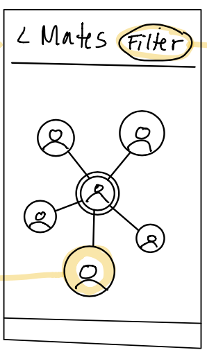
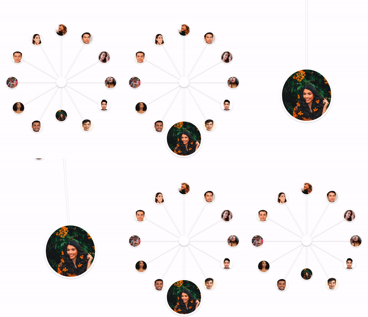
Early on in the user story phase of development, the team proposed an algorithmic system for matching prospective housemates based on desirable characteristics decided by each user. We explored the idea of presenting groups of potential housemates using a control similar to a connected-node visual. Once the user makes a selection, a more detailed view of the potential match is displayed. The design challenge we encountered was creating a transition between these two views, that was not only visually pleasing, but also intuitive from a behavior standpoint. I was tasked with exploring UI affordances for this proposed system. I created various layouts combining a matching slider with user details.

Connected-Node Wireframe

Concept for Transition Animation
Feature/Visual Redirection
In 2020, a redirection of the MVP adjusted the scope of immediate features crucial to the application. This decision simultaneously prompted a UI audit of many existing and proposed screens. I worked with the CTO on a range of new mockups to reflect the shift in the original creative direction (left) to a new design aesthetic (right). Work on the project is ongoing.
Design System
Creating the Houseme design system was a collaboration between myself and our UX researcher. We compiled data from user tests to establish the foundational principles for typography and color and then moved on to interaction-based tests using early component variants.