Brand and UI Design for the data platform turning data into doing.
As a designer for Splunk‘s in-house Brand + Creative team, I was lucky enough to be a part of a wide array of projects ranging from web design for Splunk‘s largest event and user conference, to case study design for Mclaren racing, to leading creative direction for web campaigns, to UI design for Splunk‘s web design system. Below is a selection of my work with Splunk.

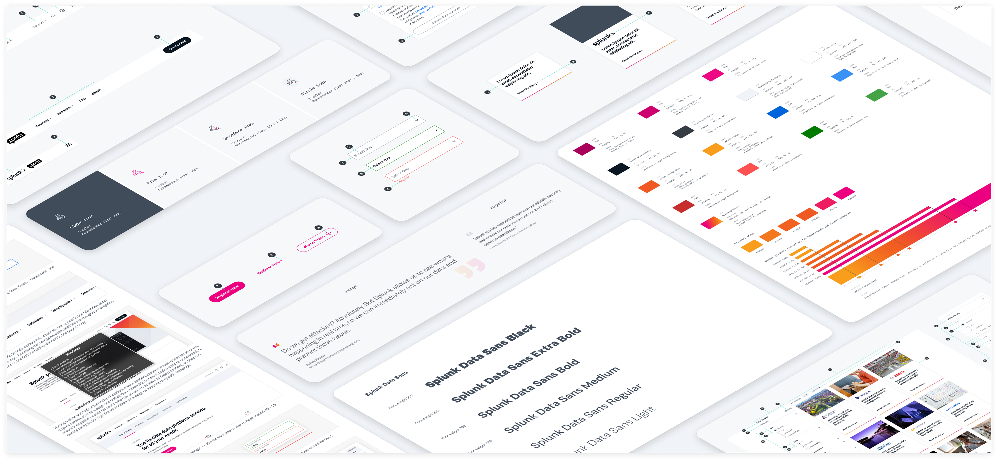
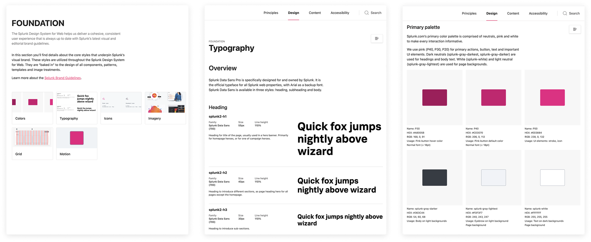
Splunk Design System for Web
Overview
The Splunk Design System for Web (SDS-Web) provides a comprehensive set of standards and resources to support a majority of Splunk‘s recurring website design needs.
The SDS-Web enables better understanding and collaboration – making it easier for Splunkers to consistently deliver high-quality web experiences that are clear, effective, and on-brand.
Role
UI Design
Working directly with the UX, Content, Web Publishing, and Dev teams to create standards for reusable components, patterns, and templates.
Building and finalizing designs for new assets with specifications to be directly handed off to the Dev team.
Organizing design system pages and assets to streamline the design process for internal employees and external vendors.
Principles
Cohesion
We want to enable designers, developers, and website owners – in-house or agency-based – with a self-service tool that helps them create web experiences that are in line with Splunk‘s web brand standards and guidelines
• Visual Style - colors, grid system, illustrations, and iconography
• Layouts - design patterns, and template content strategies
• Writing Best Practices - tone, voice, CTA style
• Dev Requirements - accessibility, performance, and code standards
Velocity
With a well-documented one-stop-shop for guidelines, templates, patterns, content matrices, and standards, it is easier for teams to execute BAU-level requests.
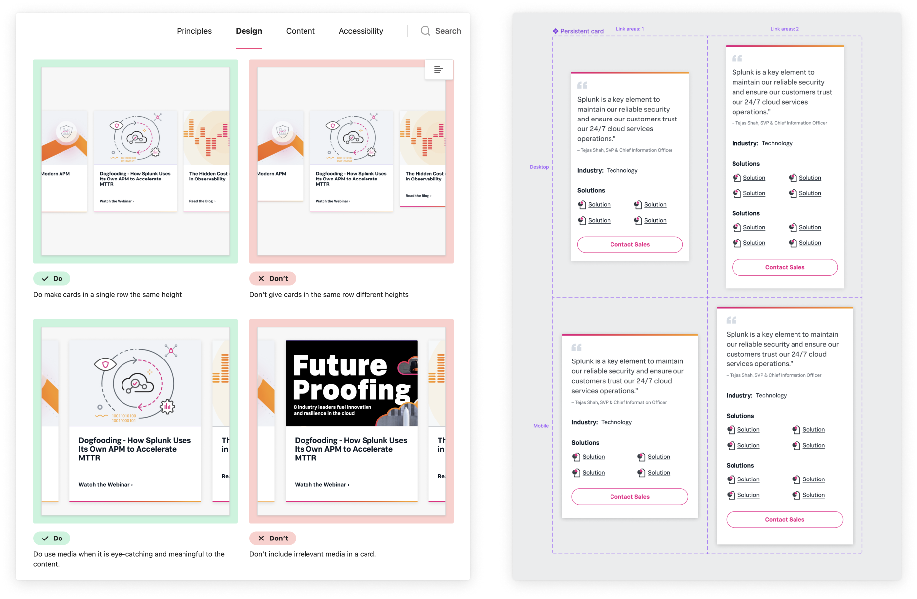
• Dos and Don‘ts clearly articulated with visuals
• Figma resources carefully connected for an easy-to-use designer experience
• Content and usage guidelines are all available both within the Figma workspace and the SDS-Web site
• Image production requirements have been cataloged and packaged for easy use
Innovation
With more requests handled as BAU, and with more stakeholders having an illuminated path to meeting their goals, the UX and UI teams can turn their attention to innovation and optimization of the web experience

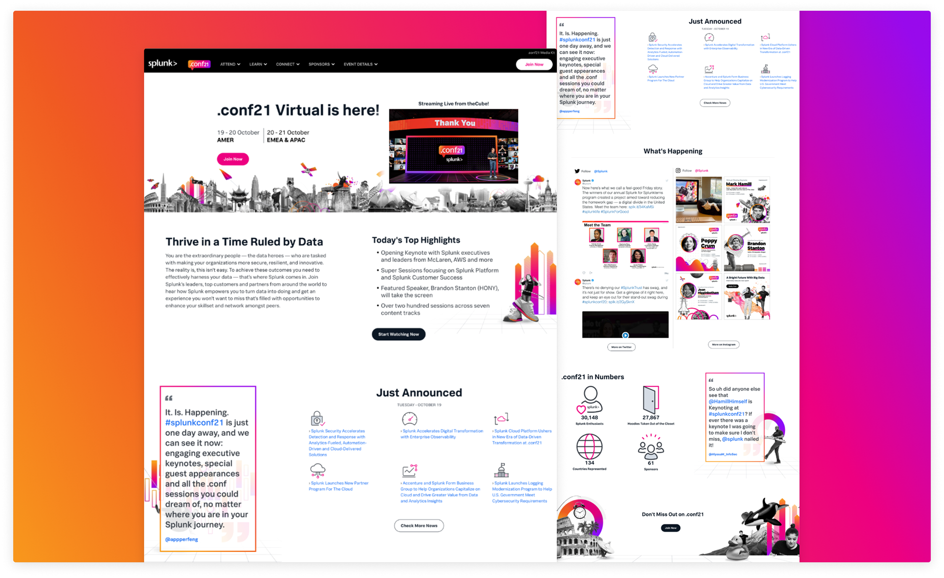
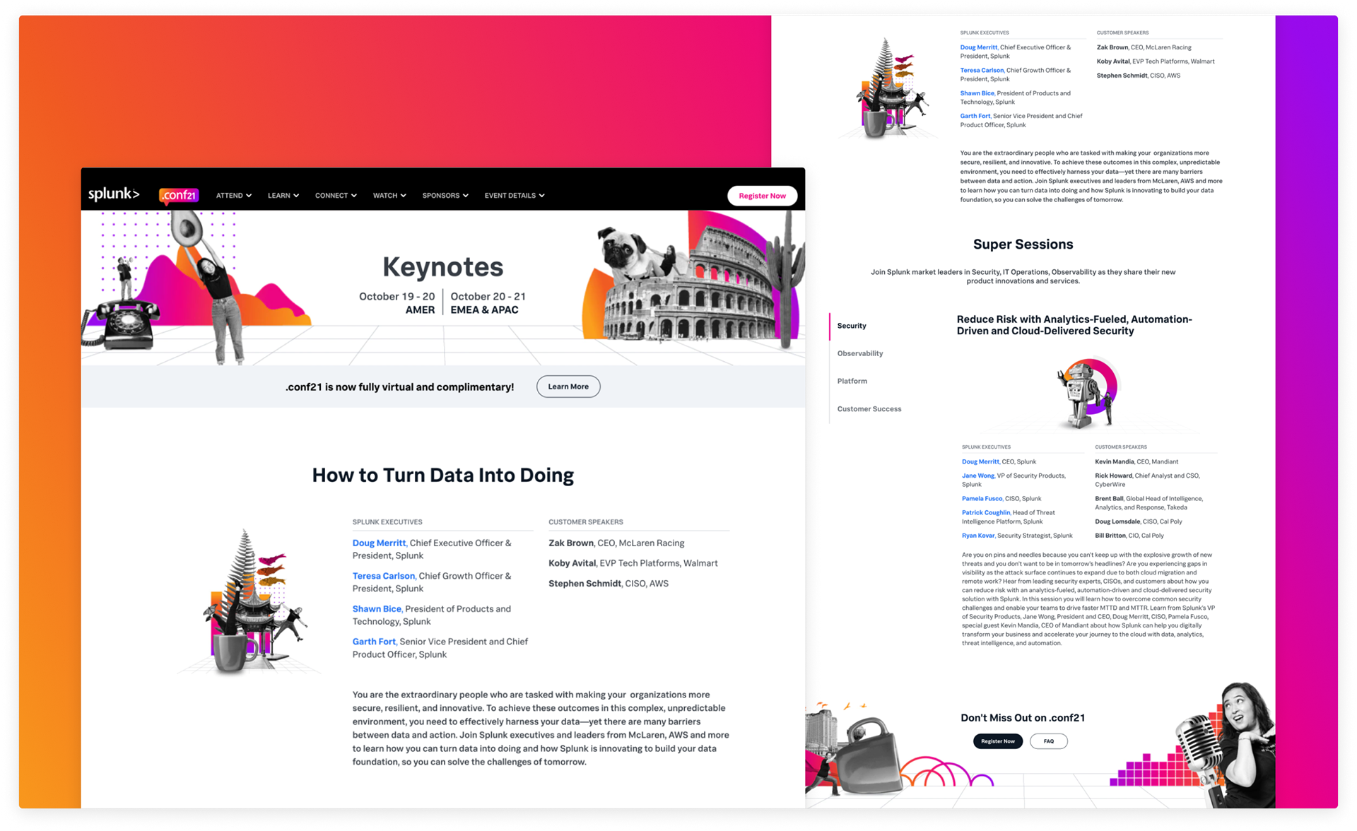
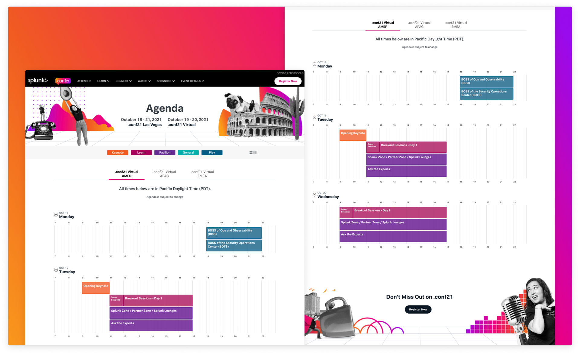
.conf21
Overview
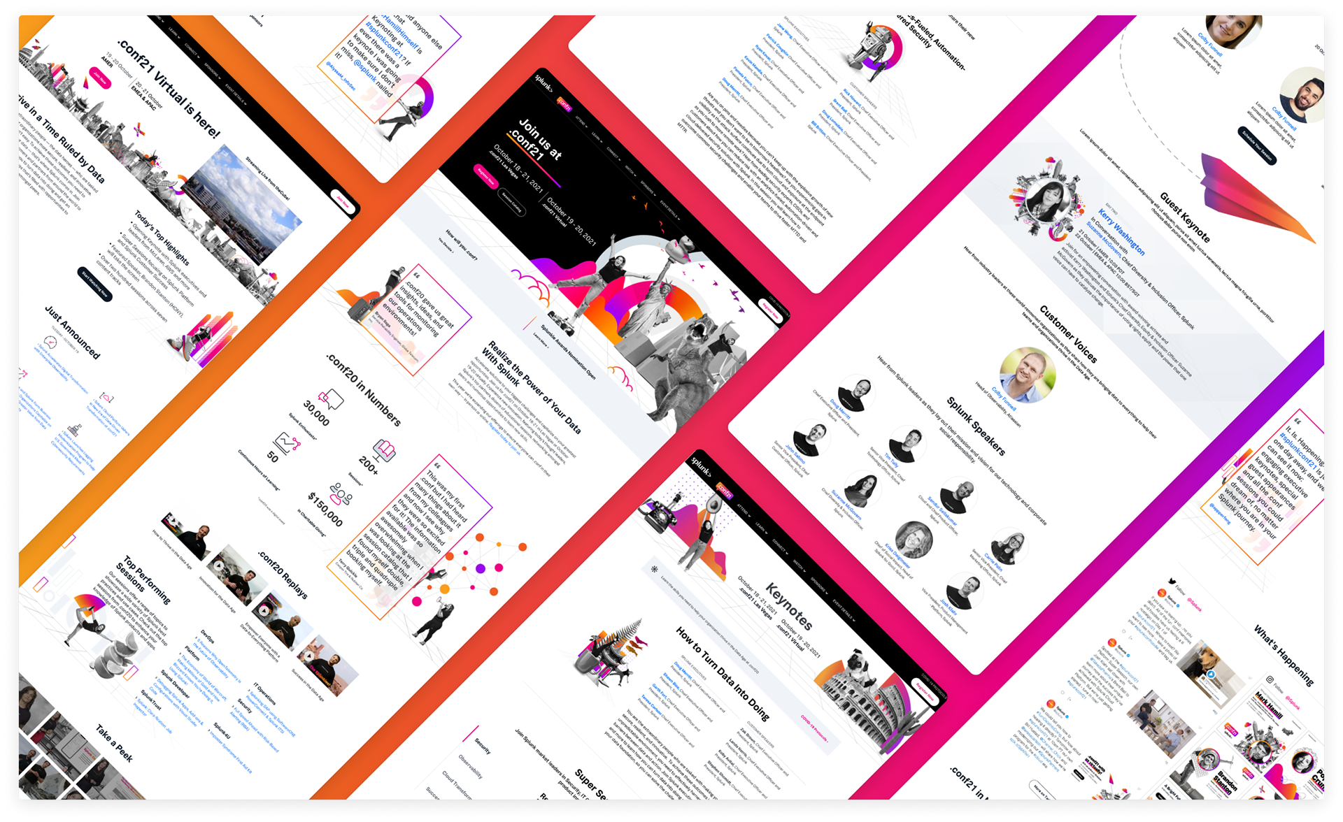
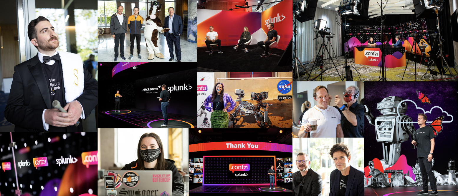
.conf is Splunk‘s annual user conference hosting thousands of attendees in-person and virtually. Each year, the Brand + Creative team creates hundreds of environmental and digital assets for the event based on design guidelines that are established by the team in the months leading up to the event.
Following the success of .conf20 going fully virtual due to the pandemic, .conf21 was set to be the company‘s first hybrid event until changes in regulations surrounding the pandemic led to a last-minute, 180-degree pivot to a fully virtual event.
Role
UI Design, Visual Design
Collaborated with other designers to establish the visual style of the event.
Created net new pages and updated existing pages on the .conf site to match the new branding.
Supported the fully virtual pivot on the website.
Handled the design of all visual assets on the site.
Design Explorations
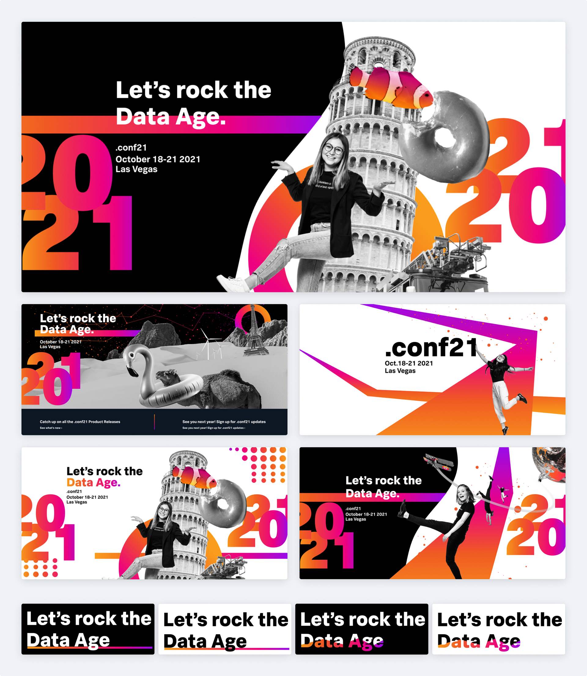
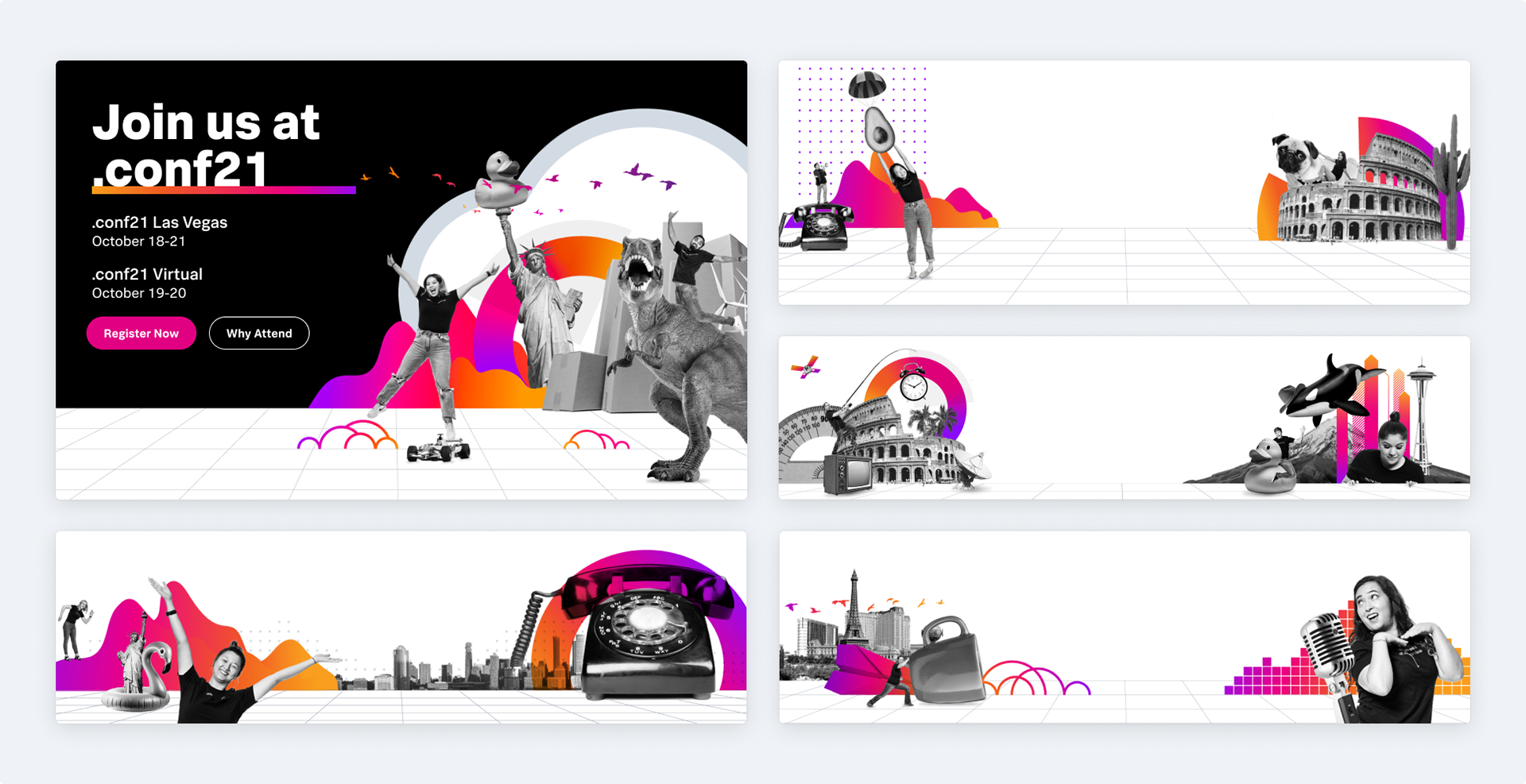
During the interim period between .conf20 and .conf21, I was tasked with creating visual explorations for the look and feel of .conf21. The team wanted to build off of the surreal collage style that was employed in the previous year‘s .conf but with a new multi-color gradient.
Focusing on the .conf website, I explored many different combinations of color blocking and dark/light modes to accentuate copy and help balance the rich colors with black and white imagery.
.conf21 Website Design
Designs for .conf webpages iterated very quickly, especially as the event date came nearer. Handling the rapid pace of work needed required close collaboration between myself, the events team, and the web publishing team. Together, we were able to build, QA, and deliver pages as needed for the event.
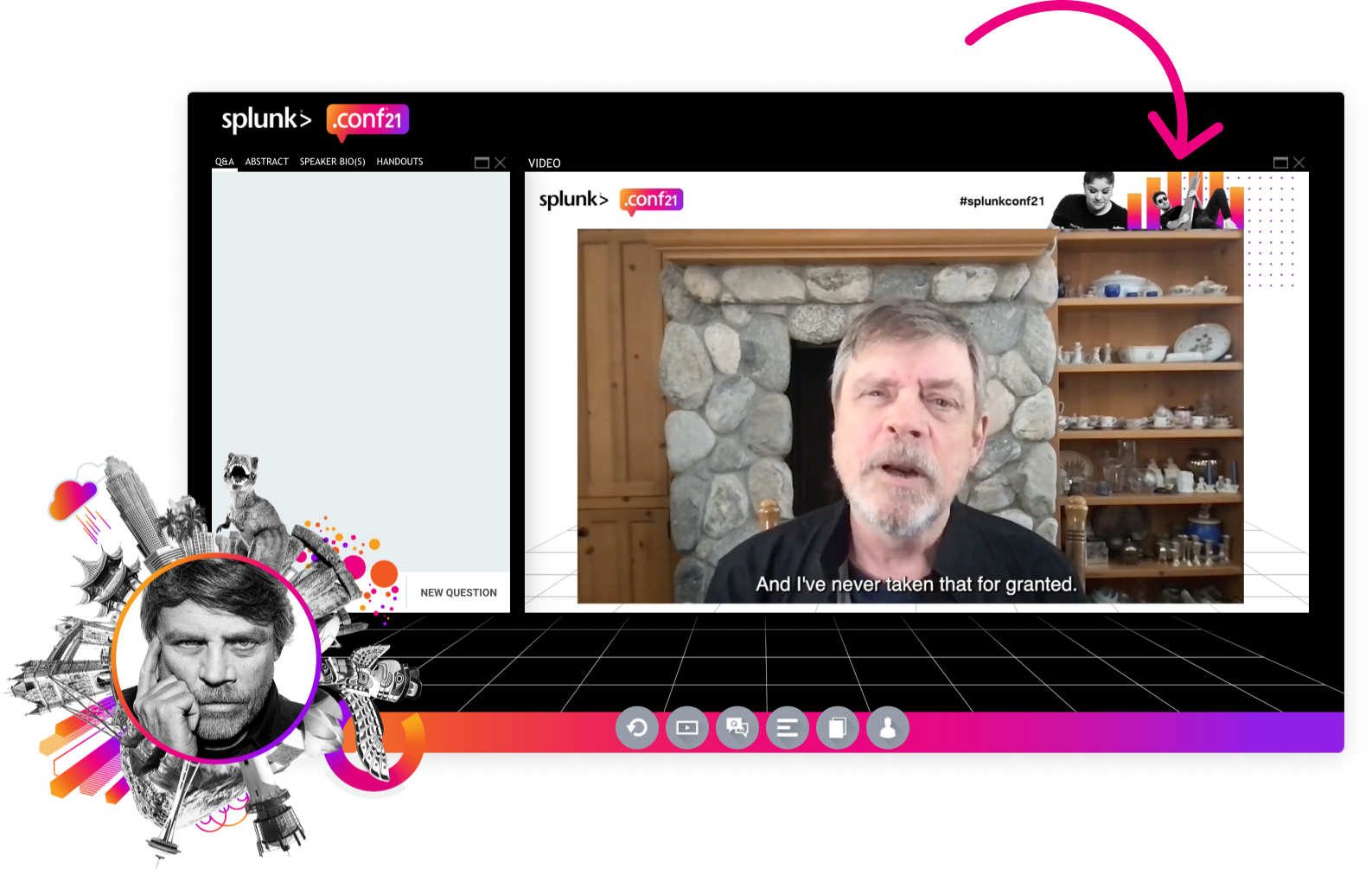
Initially, when the event was still meant to be hybrid, a tab system was implemented across areas of the site to allow users to select virtual or in-person depending on their intended experience. This system turned out to be an excellent design choice when the event transitioned to fully virtual not only because we already had the virtual user experience ready-to-go, but also because the different viewing theaters (AMER, EMEA, and APAC) were easily accounted for.
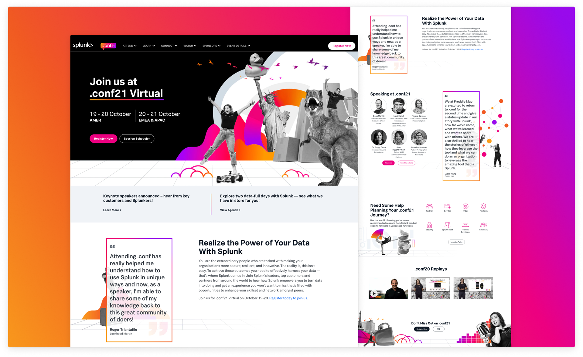
.conf21 Web Banners
Visual design for the site was carried out following the design guidelines established by Brand + Creative. This meant incorporating design reviews for the many banners and images I created into the larger design process for the site.
Results
Despite a major last-minute shift, the event was a huge success with 32.3 thousand registrations (146% of the goal of 22,000) from 136 countries. It also influenced $1.45B of pipeline (exceeding .conf20‘s $1.3B by 11%) and engaged more than 5,540 live opportunities (138% increase YoY).
I even made it on “stage” with Mark Hamill!

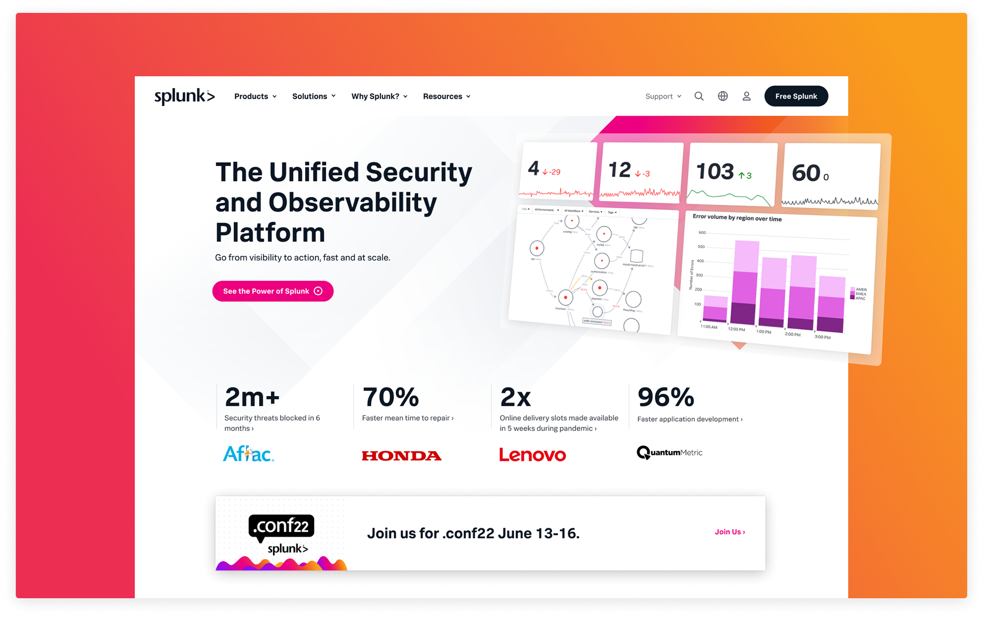
Splunk.com
Overview
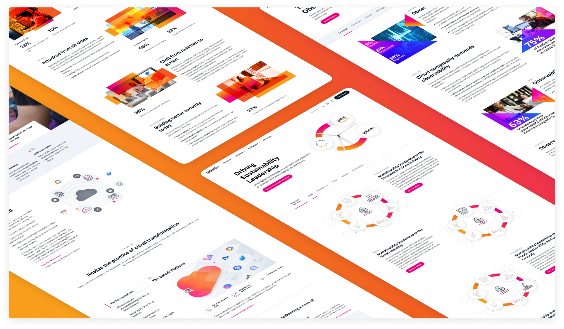
The Splunk.com site is constantly evolving to streamline user experience and increase lead conversions. In order to keep pace with product releases and new marketing initiatives, pages are updated and/or created on an almost daily basis.
Role
UI Design, Visual Design
Applying and maintaining Splunk‘s brand guidelines across Splunk.com and all other Splunk web properties.
Review and QA of net new pages and page updates.
Creation of web imagery and assets.
Innovation of web styles, components, and layouts.
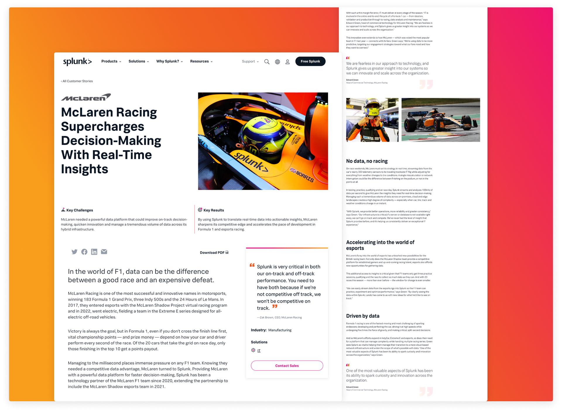
Mclaren Racing Customer Story
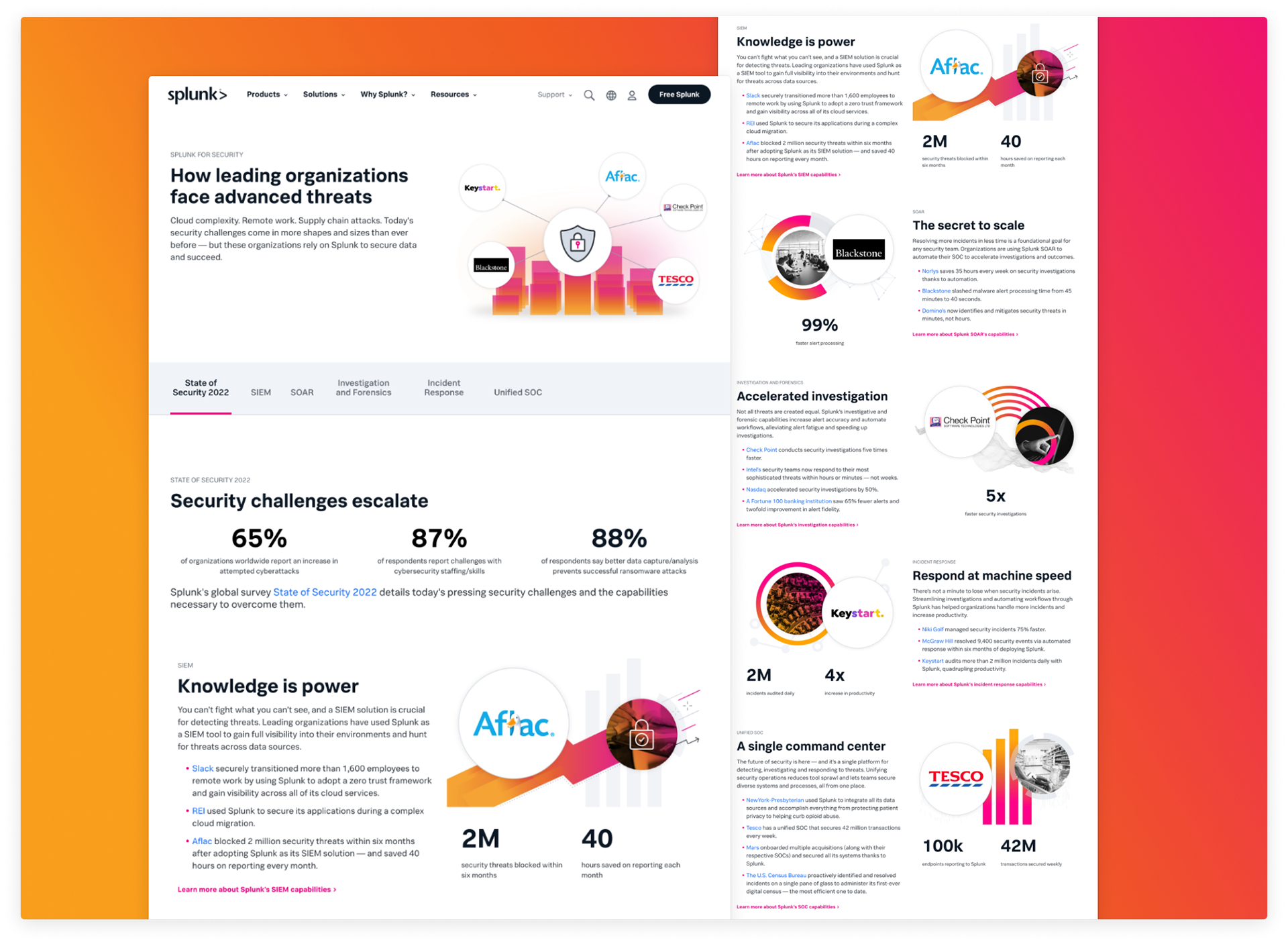
Splunk Security Customer Success
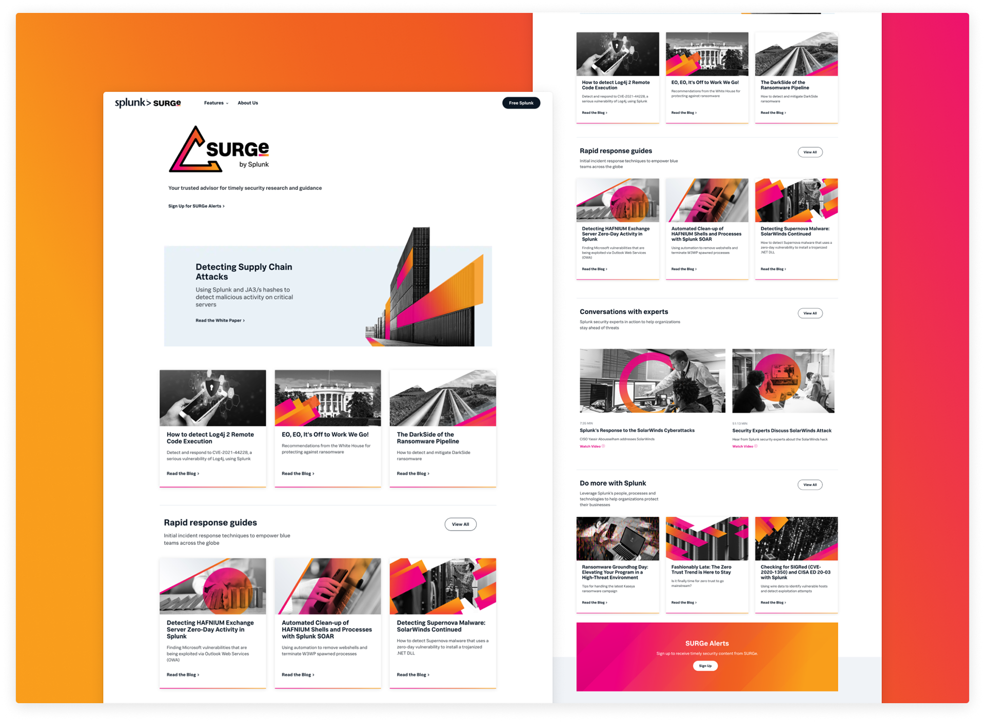
SURGe by Splunk
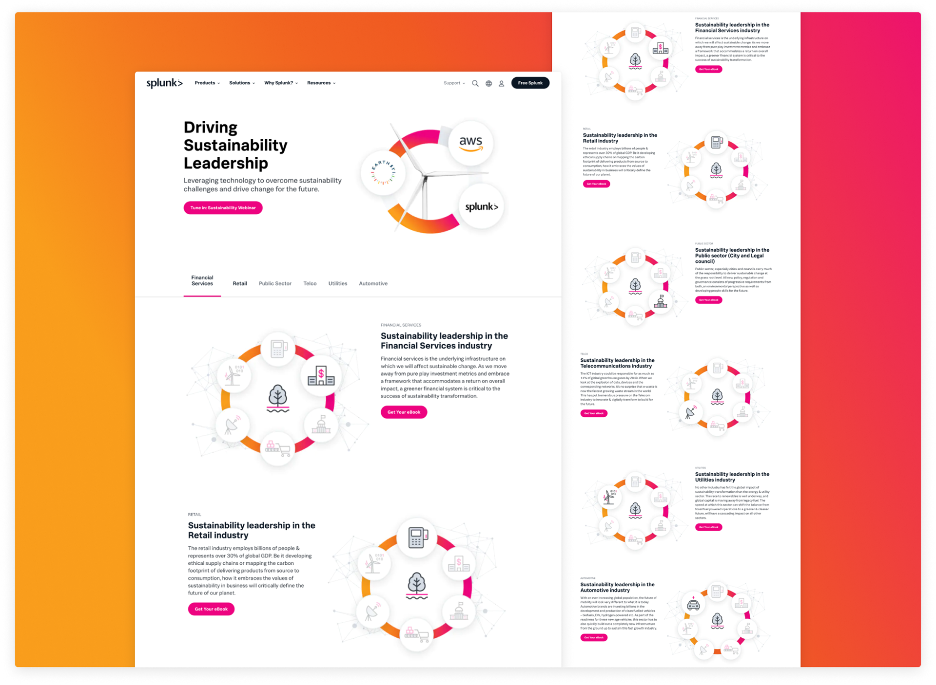
Driving Sustainability with AWS